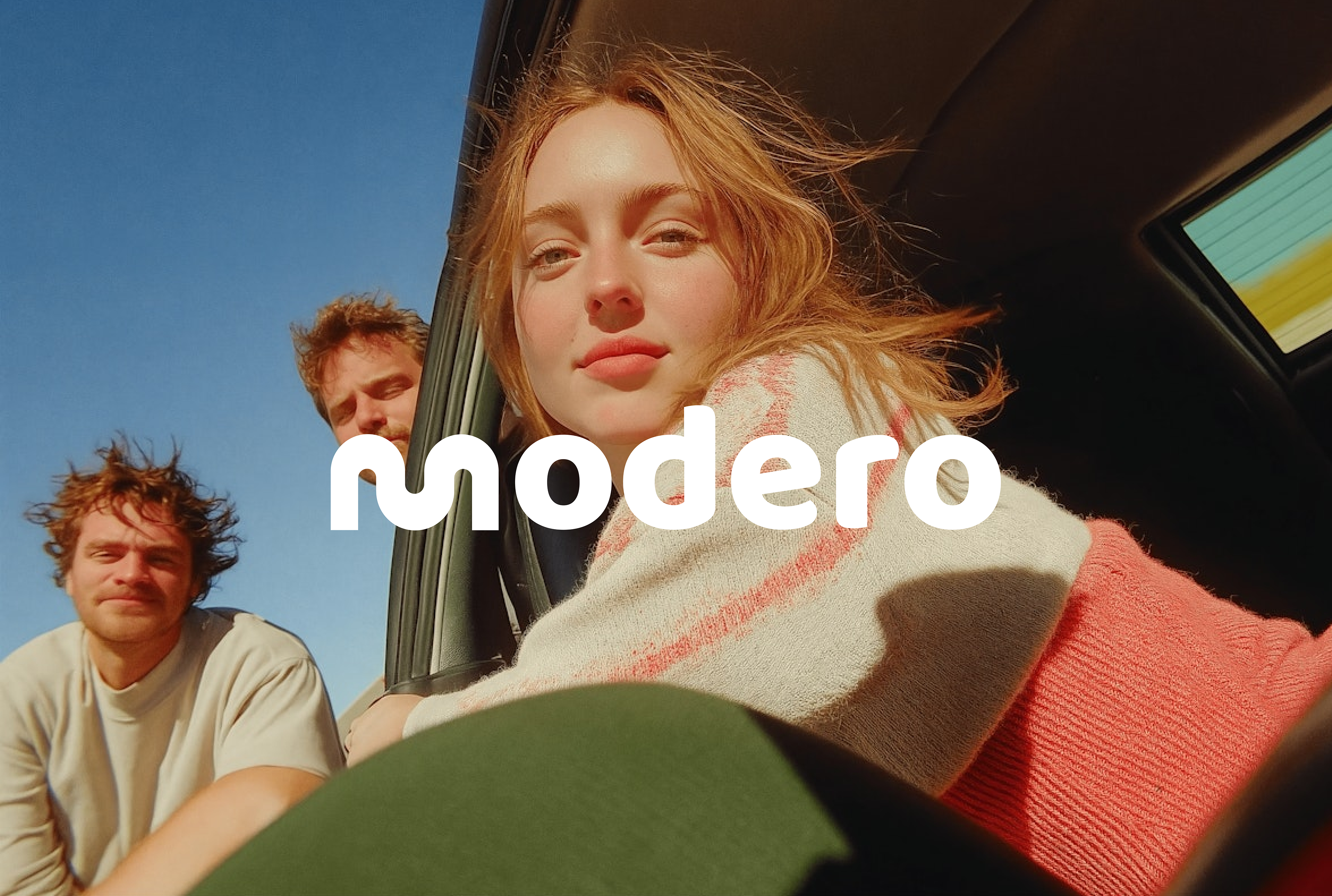
04 / MODERO
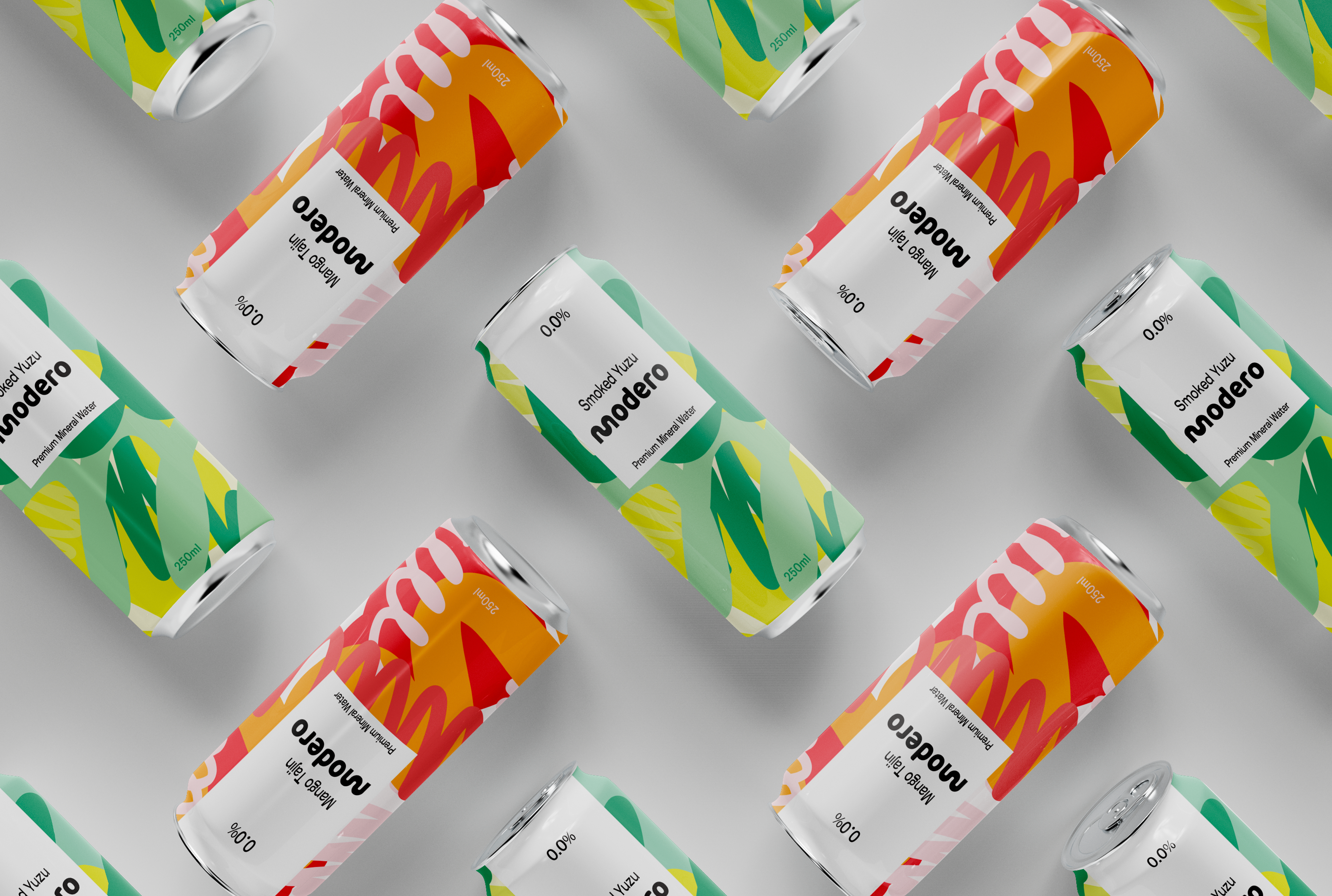
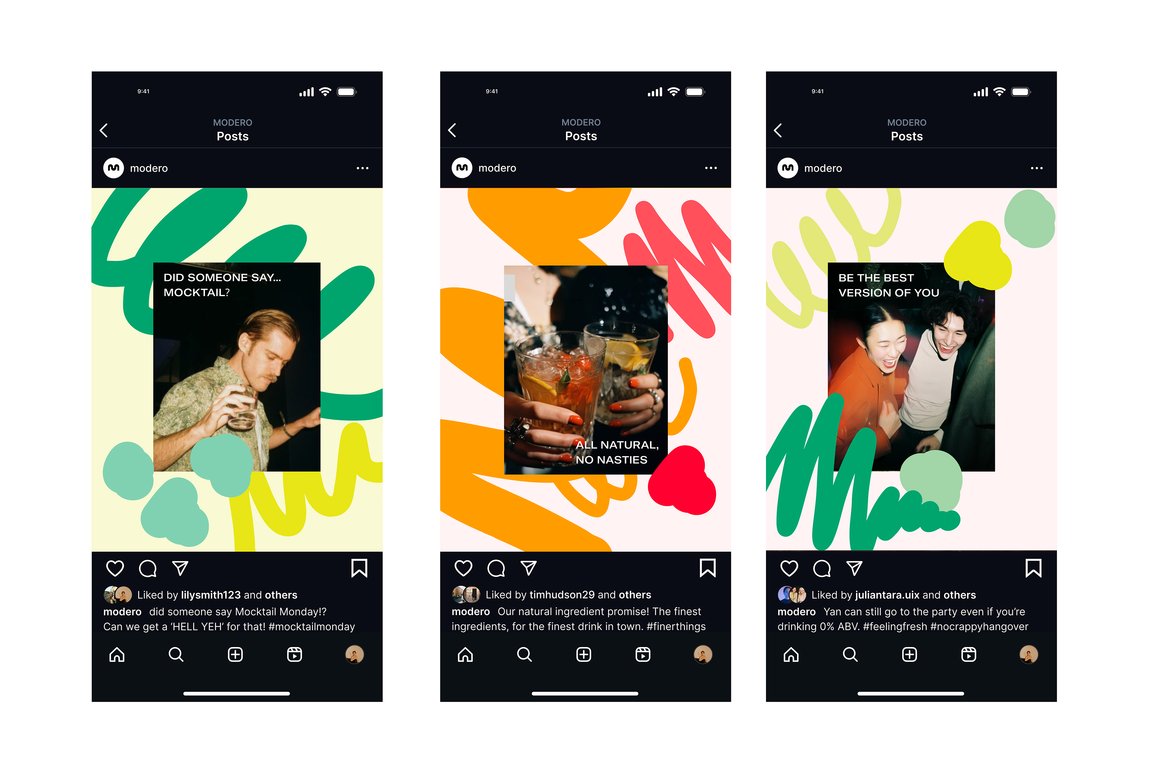
Packaging design brief for a 0% ABV mineral water that focuses on breaking away from the predictable and redefining what a non-alcoholic beverage can be. Through its commitment to bold, unusual flavour pairings that offer a vibrant, zestful twist on the everyday drink, the branding had to stand out from the crowd.
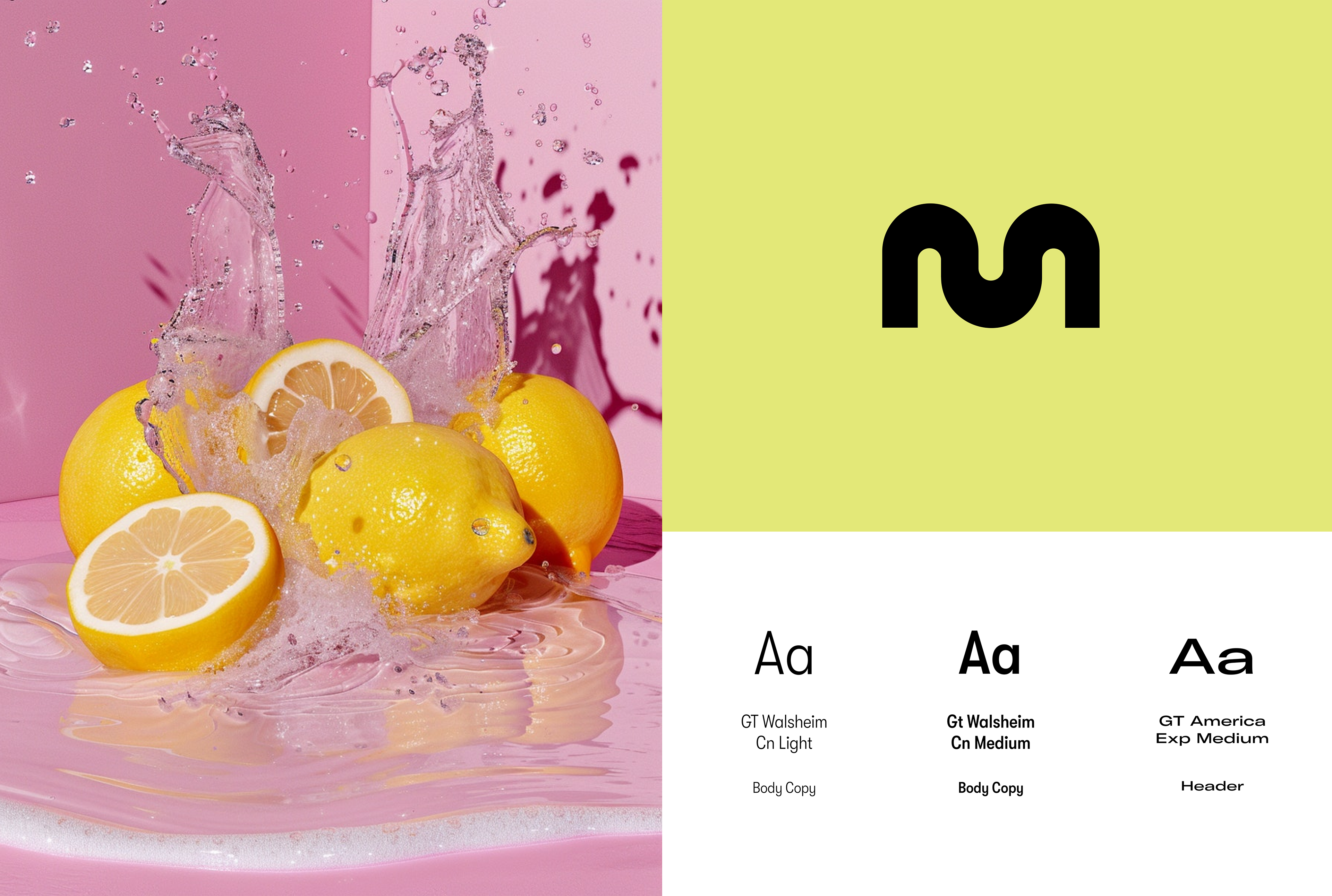
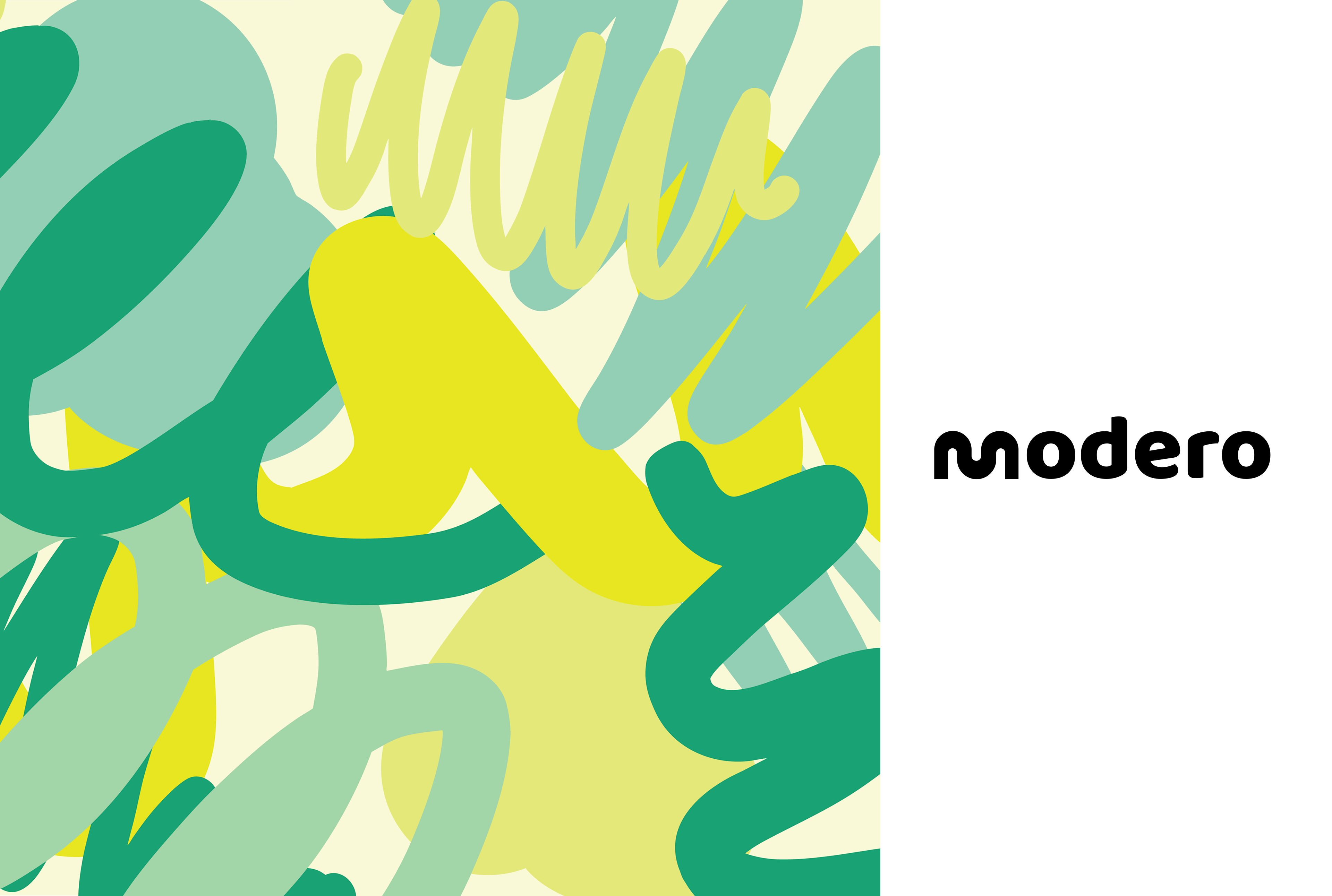
Aimed at a trend-conscious, fun-loving audience, the brands identity is rooted in maximalism. Expressed through hand-drawn graphic elements and self made patterns that wrap around
the can, the focus was to visually capture the lively, effervescent experience of taking a sip.
This project explores how expressive design and unconventional flavour can be fused to
create a product that feels exciting, fresh, and full of personality.
Brand Strategy
Brand Identity
Packaging
Brand Identity
Packaging